Designing a Modern WebGIS — Complex Operations, Simple Interface
WebGIS tools have to do two things that pull in opposite directions. They need to handle the full complexity of professional GIS — multiple geometry formats, layered styling, 3D terrain, real-time data, animation, plugins — while staying approachable enough for non-specialist users: educators, planners, citizens, disaster-prevention teams. Most tools end up picking one side: dense and unfriendly, or simple but limited.
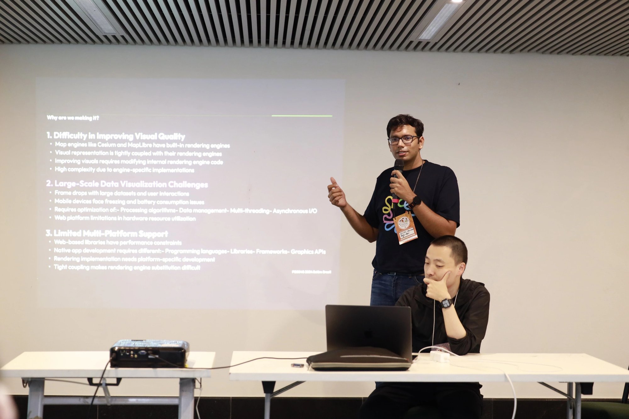
The question I've been working with is whether that's a real trade-off, or whether interface design can collapse the apparent complexity into something that looks simple from the outside but still does the hard work underneath. Several design decisions I shared in the talk:
- Folding multi-step GIS workflows into single, direct interactions — complex operations as a simplified UI
- A new layer system that abstracts geometry across diverse GIS formats and treats style as code
- A sketch layer for free-form 2D / 3D shape authoring directly inside the map
- Scroll-based storytelling — using page scroll to drive narrative-driven projects
- Plugins as a real-time extension surface for layers and the 3D globe at runtime
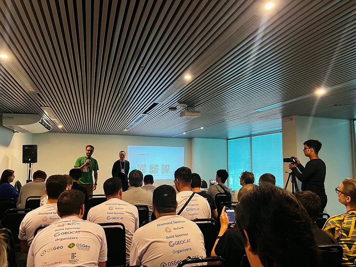
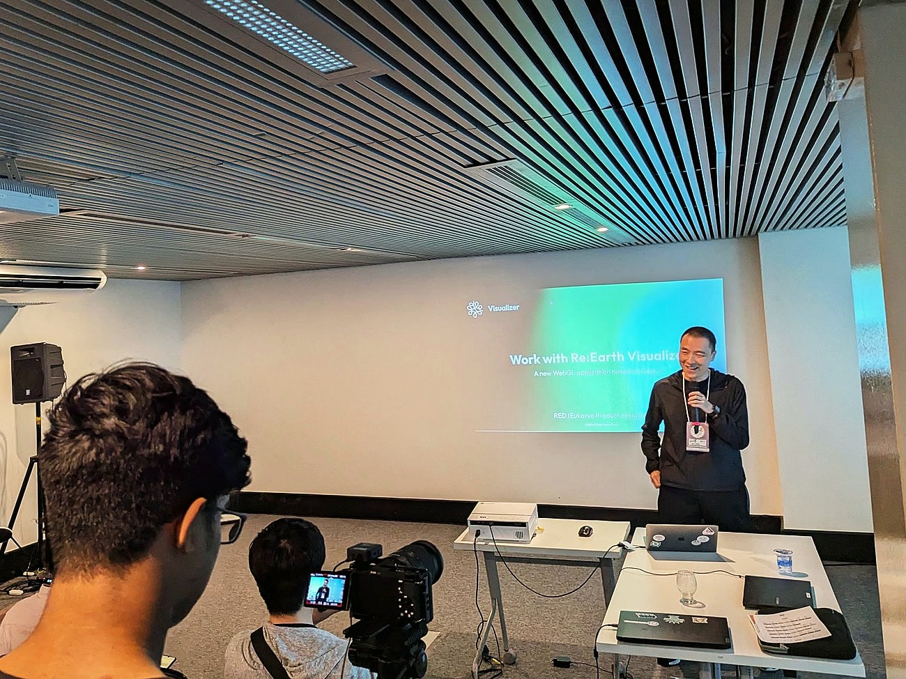
These weren't presented as features; each was a small bet on a specific design question. The talk drew on Re:Earth Visualizer — the open-source WebGIS our team builds, used across the MLIT PLATEAU initiative and a range of education, urban-planning, disaster-prevention, and transportation projects — but the focus was on the design decisions themselves: what worked, what didn't, and what we'd do differently.
WebGIS is one of those domains where interface design isn't a polish layer on top of the technology — it's where most of the actual leverage lives.
--- layout: talk.njk title_zh: "设计一个现代 WebGIS —— 把复杂操作收进简洁的界面里" title_ja: "モダンな WebGIS をデザインする — 複雑な操作を、シンプルなインターフェースに" title_en: "Designing a Modern WebGIS — Complex Operations, Simple Interface" year: 2024 event: FOSS4G 2024 eventUrl: https://2024.foss4g.org/ role: speaker location: 巴西,贝伦 location_ja: ブラジル・ベレン location_en: Belém, Brazil cover: /images/talks/foss4g-2024-designing-webgis/hero.jpg description: "WebGIS tools sit at an awkward intersection: they need the full power of professional GIS — layers, geometries, styling, 3D, real-time data, plugins — while staying approachable to non-specialist users in education, planning, and disaster prevention. A walk through the interface decisions our team has been making while building a modern WebGIS." workTags: - talk --- <div lang="zh"> WebGIS 工具身上有两种互相拉扯的要求。一方面,它要能撑得起专业 GIS 的全部复杂性——多种几何格式、图层样式、3D 地形、实时数据、动画、插件。另一方面,它又要让教育、城市规划、市民、防灾这些非专业用户也能用得上。大部分工具最后都偏向一边:要么专业但难用,要么简单但能力有限。 我自己一直在想的问题是:这真的是一个 trade-off 吗,还是说,可以通过界面设计,让一个东西看起来很简单,底下却依然能完成那些复杂的事?这次演讲里,我分享了几个具体的设计判断: - 把多步的 GIS 工作流折叠进一次直接的交互——把「复杂操作」做成「简洁 UI」 - 一套新的图层系统,把不同 GIS 格式之间的几何抽象统一起来,并把样式当成代码来管理 - 一个 sketch layer,让用户可以直接在地图里自由画 2D / 3D 形状并保存到图层 - 用页面滚动来推进叙事型的项目 - 把插件做成运行时的扩展点,让外部代码可以在运行时扩展图层和 3D 地球 这些不是为了铺一张「功能清单」,每一个其实是对某个具体设计问题的一次小赌注。演讲里我以 Re:Earth Visualizer 为素材——这是我们团队在公开开发的开源 WebGIS,被用在国土交通省 PLATEAU 计划,以及教育、城市规划、防灾、交通等多个项目里——但谈的不是产品本身,而是它底下的那些设计判断:什么有效、什么无效、再做一遍我会改什么。 WebGIS 属于这样一种领域:界面设计不是贴在技术上的一层化妆,而是真正能撬动结果的地方。 </div> <div lang="ja"> WebGIS のツールには、互いに引き裂き合う 2 つの要請がある。プロ向け GIS の全ての複雑さ──多様なジオメトリ形式、レイヤースタイル、3D 地形、リアルタイムデータ、アニメーション、プラグイン──を扱えなければならない。同時に、教育、都市計画、市民、防災チームといった非専門ユーザーにも届かなければならない。多くのツールは結局どちらかに寄ってしまう。専門的だが取っ付きにくいか、シンプルだが機能が限られているか、のどちらかだ。 私たちが向き合ってきた問いは、これが本当にトレードオフなのか、それとも、表面はシンプルに見えながら裏ではちゃんと複雑な仕事をする設計があり得るのか、というものである。今回の登壇では、いくつかの設計判断を紹介した。 - 多段階の GIS ワークフローを、ひとつの直接的なインタラクションに折りたたむ──「複雑な操作」を「シンプルな UI」へ - 多様な GIS 形式にまたがってジオメトリを抽象化し、スタイルをコードとして扱う新しいレイヤーシステム - マップ内で 2D / 3D の図形を自由に描き、レイヤーに保存できるスケッチレイヤー - ページのスクロールで物語を進めていく、スクロールベースのストーリーテリング - レイヤーや 3D 地球をランタイムに拡張する、プラグインの仕組み これらは「機能」として並べたかったのではなく、それぞれが具体的な設計の問いに対する、小さな賭けである。登壇では Re:Earth Visualizer──私たちのチームがオープンに開発している WebGIS で、国土交通省 PLATEAU プロジェクトや、教育、都市計画、防災、交通など複数のプロジェクトで使われている──を素材にしながら、製品そのものではなく、その下にあるデザインの判断を語った。何が効き、何が効かなかったか、もう一度やるなら何を変えるか。 WebGIS は、インターフェース設計が技術の上に乗った「化粧」ではなく、効き目の大半がそこに眠っている領域のひとつだと思っている。 </div> <div lang="en"> WebGIS tools have to do two things that pull in opposite directions. They need to handle the full complexity of professional GIS — multiple geometry formats, layered styling, 3D terrain, real-time data, animation, plugins — while staying approachable enough for non-specialist users: educators, planners, citizens, disaster-prevention teams. Most tools end up picking one side: dense and unfriendly, or simple but limited. The question I've been working with is whether that's a real trade-off, or whether interface design can collapse the apparent complexity into something that looks simple from the outside but still does the hard work underneath. Several design decisions I shared in the talk: - Folding multi-step GIS workflows into single, direct interactions — complex operations as a simplified UI - A new layer system that abstracts geometry across diverse GIS formats and treats style as code - A sketch layer for free-form 2D / 3D shape authoring directly inside the map - Scroll-based storytelling — using page scroll to drive narrative-driven projects - Plugins as a real-time extension surface for layers and the 3D globe at runtime These weren't presented as features; each was a small bet on a specific design question. The talk drew on Re:Earth Visualizer — the open-source WebGIS our team builds, used across the MLIT PLATEAU initiative and a range of education, urban-planning, disaster-prevention, and transportation projects — but the focus was on the design decisions themselves: what worked, what didn't, and what we'd do differently. WebGIS is one of those domains where interface design isn't a polish layer on top of the technology — it's where most of the actual leverage lives. </div> <div class="gallery"> <img src="/images/talks/foss4g-2024-designing-webgis/hero.jpg" alt="FOSS4G 2024 贝伦大会・演讲现场"> <img src="/images/talks/foss4g-2024-designing-webgis/on-stage.jpg" alt="FOSS4G 2024 贝伦大会・演讲现场(开场幻灯片)"> <img src="/images/talks/foss4g-2024-designing-webgis/panel.jpg" alt="FOSS4G 2024 贝伦大会现场 Q&A 环节"> </div>